Two progressive lenses can carry the same prescription and still feel different when you turn your eyes or head. The reason is not that one lens has peripheral blur and the other does not. Both do. The design choice changes where that blur is placed, how quickly it builds, and how much central viewing area is protected.
Quick answer
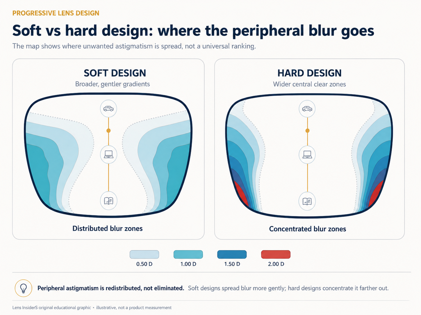
A soft progressive design spreads unwanted astigmatism across a broader area with gentler changes. A hard progressive design concentrates more of it into smaller side areas so the central distance and near zones can be wider or more sharply defined. These are design tendencies, not regulated grades. “Soft” is not always easier, and “hard” is not automatically clearer.
Soft and hard do not describe the lens material
The terms refer to the distribution of optical error across a progressive addition lens. They do not tell you whether the lens is made from CR-39, polycarbonate, Trivex, or a high-index material. They also do not describe the scratch coating.
A progressive lens must change power from the distance area to the full near addition. That power change creates unwanted astigmatism away from the central progression path. Designers can move and reshape those areas, but they cannot make the entire lens clear at every distance.
This is the first useful rule: a lens map is a distribution map, not a map of “good lens” versus “bad lens.”
What unwanted astigmatism means on a lens map
On a technical progressive map, contour lines often show equal amounts of unwanted cylinder in diopters. A 0.50 D contour surrounds locations where the mapped cylinder reaches about 0.50 diopter. Higher-value contours indicate a stronger optical departure from the clear central path.
The visual effect is usually described as side blur, swim, stretching, or a loss of stable detail. The map does not predict exactly what one person will notice. The result also depends on ADD power, distance prescription, cylinder correction, corridor length, frame position, pupil size, viewing distance, head movement, and previous wearing experience.
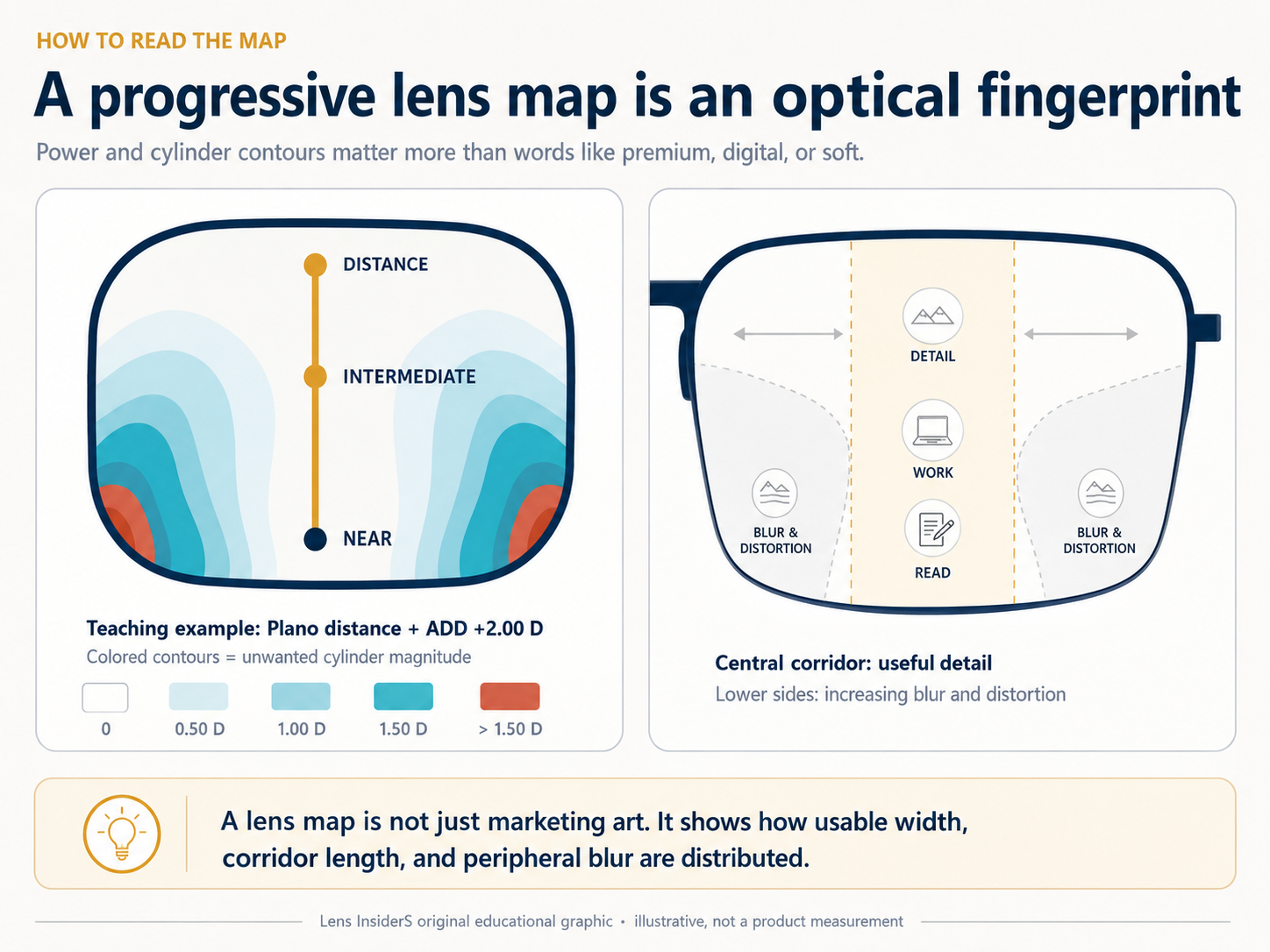
The sample map uses a plano distance prescription with a +2.00 D ADD only to explain the graphic. It is not a measured map of a retail product. A real product comparison must hold the prescription, ADD, fitting geometry, map scale, and measurement method constant.
What the Minkwitz relationship tells us
The Minkwitz theorem links the rate of power change along a progressive corridor to the growth of unwanted astigmatism across it. A widely cited measurement study led by James Sheedy found that designers can steer astigmatism and change its local magnitude, but the gains and losses tend to balance across the full corridor. Their practical conclusion was restrained: for a given power change across a given distance, unwanted astigmatism can be redistributed but probably not simply removed.
Modern free-form calculations are more complex than a basic Minkwitz diagram. A generalized treatment includes surface geometry beyond one central line. The buying lesson remains useful. Be cautious when a seller implies that one premium design has eliminated peripheral distortion.
How a soft progressive design behaves
A soft design generally allows unwanted astigmatism to occupy a broader area while reducing abrupt local changes. The wearer may encounter blur earlier when looking sideways, but the transition into it can feel less sudden.
That can support comfortable scanning and movement for some people. It may also leave less sharply bounded central distance or near fields than a harder design using the same basic constraints.
| Potential strength | Possible limitation |
|---|---|
| Gentler change as the gaze moves away from the corridor | Blur may extend across a larger total area |
| Can feel less abrupt during head and eye movement | Central zones may not feel as sharply separated |
| May suit a wearer who disliked sudden peripheral changes | “Soft” does not guarantee easy adaptation |
How a hard progressive design behaves
A hard design generally protects wider or more clearly defined central viewing zones by concentrating unwanted astigmatism into smaller peripheral regions. The change from useful central vision to the side blur can be steeper.
Some experienced progressive wearers like the direct access to a wider reading or distance area. Another wearer may notice the concentrated side distortion more strongly during walking, driving scans, or quick head movement.
| Potential strength | Possible limitation |
|---|---|
| Can preserve wider central distance or near fields | Peripheral blur may build more abruptly |
| Zones can feel more clearly defined | Dynamic movement may feel less forgiving |
| May match a successful previous hard-style design | A wider zone on paper does not fix poor fitting |
How much “disorder” is in the peripheral zone?
The more precise term is unwanted astigmatism, measured in diopters. There is no universal number for “the peripheral disorder of a progressive lens.” It changes across every point on the surface. One side location may measure 0.50 D, another 1.00 D, and a lower peripheral pocket may be higher.
ADD power matters. A +2.50 D addition requires a larger power change than a +1.25 D addition. Corridor length matters too. Compressing the power change into less vertical distance generally makes the optical balancing act more demanding.
A useful product map should disclose at least five things:
- the distance prescription and ADD used for the map;
- the corridor or fitting configuration;
- the contour interval, such as 0.25 D or 0.50 D;
- whether the plot shows surface astigmatism, ray-traced wearer power, or another metric;
- the same scale and lens outline for every product being compared.
Without those controls, a darker marketing graphic can look worse simply because its color scale starts lower.
Who may prefer a softer design?
A soft design can be a reasonable starting hypothesis for a first-time wearer who is sensitive to abrupt peripheral change, or for someone whose day involves frequent scanning and movement. It can also be useful when the wearer reports that the boundary between clear and blurred areas in a previous lens felt harsh.
That is not a prescription rule. A first-time wearer may prefer a harder design because a wider near zone matters more. A person who walks all day may still prefer a concentrated design after trying both.
Who may prefer a harder design?
A harder design can be a reasonable starting point for an experienced wearer who has succeeded with a similar map, values a wide central reading or distance area, and tolerates more localized side distortion. It may also suit a task where stable central detail matters more than broad peripheral scanning.
Previous-lens history is valuable. Ask the dispenser to identify the old design markings and record what worked. Replacing a successful hard-style lens with a very different soft design can create a surprise even when the prescription is unchanged.
Why product names do not settle the question
Manufacturers increasingly describe progressive products with terms such as balanced, personalized, binocularly optimized, or lifestyle designed. Those features may be meaningful, but they do not create a standard soft-to-hard scale shared across brands.
Current HOYA product information, for example, publishes minimum fitting heights, corridor choices, position-of-wear inputs, and personalization features for several designs. ZEISS publishes fixed and variable corridor options across its SmartLife range. These specifications help narrow the choice. They still do not let a consumer declare one entire brand “soft” and another “hard.”
Ask for the exact design name. Then ask which viewing area that design prioritizes, which measurements it uses, and whether a comparable wearer-power map is available.
Soft, hard, and corridor length are related but not identical
A short corridor forces the near addition to develop over less vertical space. A designer may respond by changing where unwanted astigmatism is concentrated, but “short” is not a synonym for “hard.” A long design is not automatically soft either.
Read our long vs short progressive corridor guide before treating either label as a complete product description.
How to compare two progressive products fairly
- Use the same prescription, ADD, frame shape, fitting height, and map scale.
- Compare distance, intermediate, and near zone width at stated blur thresholds.
- Look at the gradient between contours, not only the maximum value.
- Check whether the map is surface data or calculated wearer performance.
- Match the design to the wearer’s primary task and previous-lens history.
- Confirm the remake or non-adapt policy before paying for an unfamiliar design.
Frequently asked questions
Is a soft progressive always best for a first-time wearer?
No. It may reduce abrupt peripheral changes, but the wearer may value a wider reading or distance zone more. Accurate measurements, stable frame fit, and task priorities can matter more than the label.
Does a hard design have more peripheral blur?
Not necessarily more in total. It generally concentrates the unwanted astigmatism into smaller regions, often with higher local gradients. A fair comparison needs matched maps and scales.
Can a premium progressive remove all unwanted astigmatism?
No progressive can make every location carry the correct distance, intermediate, and near power at the same time. Premium calculations can redistribute errors and optimize the result for prescription and position of wear.
Why did my new lens feel different with the same prescription?
The new pair may use a different design philosophy, corridor, base curve, material, frame position, or fitting data. Bring both pairs to a recheck so the dispenser can compare markings and measurements.
Sources and further reading
- Sheedy et al.: Progressive powered lenses and the Minkwitz theorem
- Journal of Optometry: Visual acuity and preference in hard and soft progressive designs
- Theoretical performance of progressive lenses with poorly measured individual parameters
- HOYA: Current progressive designs and fitting specifications
- ZEISS SmartLife progressive fact sheet
Professional note: Lens maps are design aids, not a diagnosis or a guarantee of adaptation. Persistent central blur, double vision, pain, sudden vision change, flashes, or new floaters requires professional assessment.

About Ho Truong
Ho Truong is a trained optician at a family optical practice established in 1991. Lens InsiderS explains lens design and fitting choices for buyers. It does not diagnose eye conditions or replace an eye examination.